up:: 🧰 Library Usage Guide x:: ∑ This library's ACCESS workflow summary
Tip💡
Obsidian version 0.16 has a major interface change. The following screenshots may be a bit outdated, but the basic design logic remains the same and can still be used as a reference.
Workspace
To be honest, I’m not used to the workspace thinking mentioned in Homepage and Workspace. The fundamental reason is probably that my work nature determines that I don’t have to completely switch between different work scenarios, such as writing a novel now and then immediately switching to video editing. On the other hand, I also enjoy the feeling of closing pages or windows one by one, which gives me a sense of accomplishment after finishing my work 😃.
But the workspace can actually be used as git stash. It will be practiced in the future when I need to switch work scenarios frequently and am busy.
So this library actually only uses one workspace most of the time. The most common use process is to open 2-3 editing panels. If you work with a laptop touchpad, you will enable Sliding Panes (Andy's Mode). The advantage is that the width of each page is fixed, so the editing experience is smooth, and you can quickly slide left and right to find the editing records of more than a dozen documents before. Students who like to open new tabs instead of opening them in place when using a browser should like it. The editing mode is as follows:
This mode is generally modified to a vertical arrangement of title bars in the web reading mode, which serves as a breadcrumb and preserves the context. As shown below:
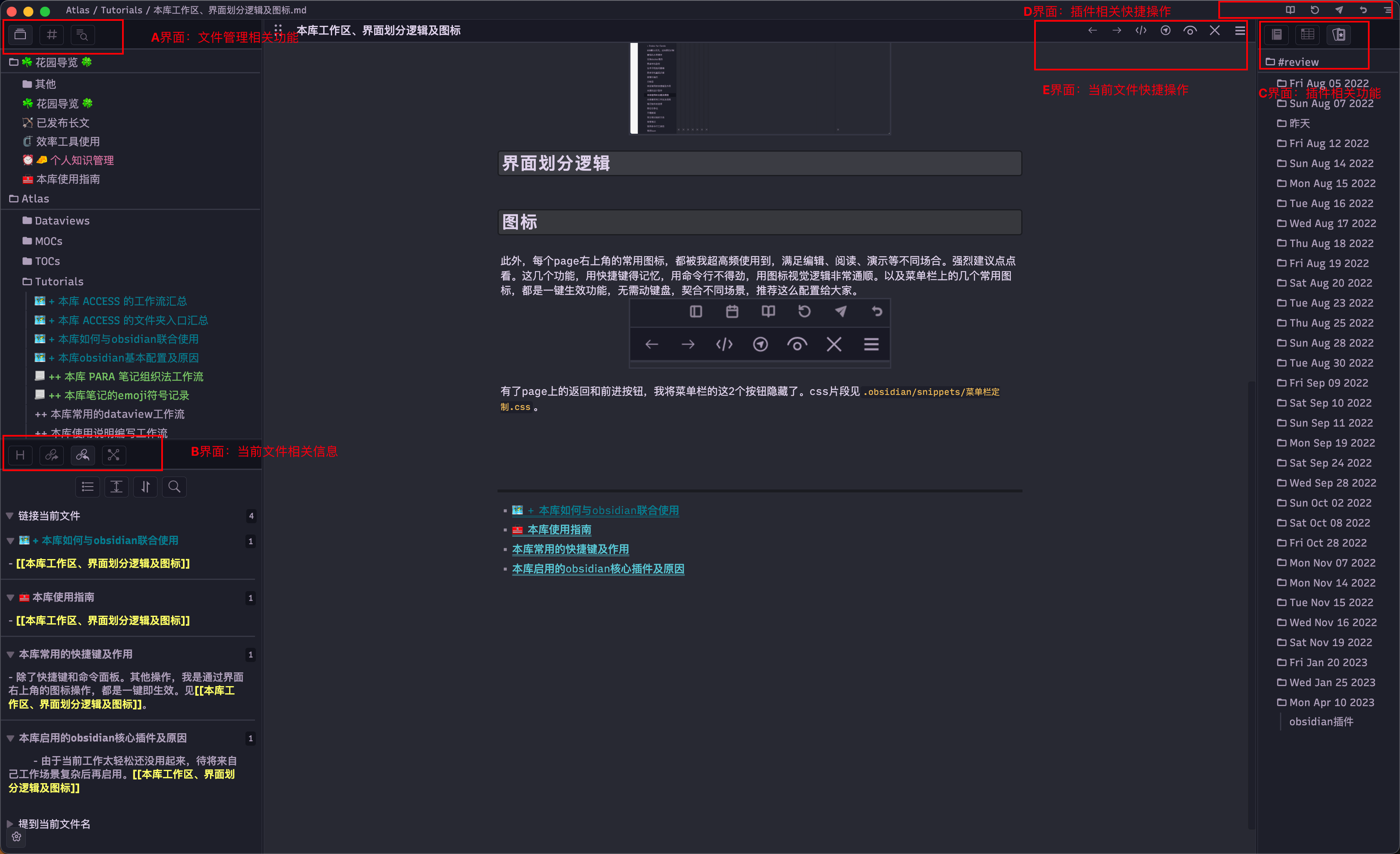
Interface division logic
- The ribbon on the far left is hidden. Because these buttons are all commands, they don’t interact with other display areas on the interface, and the semantic logic is completely different from the ribbon on the far left in Spaces/3-Resource/Software-Sorting/macos-software/VSCode.
- Interface A in the upper left corner is related to file management.
- Interface B in the lower left corner is related to the current file information.
- Interface C on the right is related to the functional interface provided by the plugin. Hide it when not in use.
- The icons in the upper right corner are all frequently used shortcut functions for the obsidian software layer. Customized by the Commander plugin.
- The icons in the upper right corner of the editing page are all common shortcut operations for the current file. Customized by the Commander plugin.
Icons
Continuing from the previous section, let’s talk more about the two rows of icons in the upper right corner. Each commonly used icon in the upper right corner of the current file is used by me at a super high frequency to meet different occasions such as editing, reading, and demonstration. It is strongly recommended to click and see. These functions need to be memorized with shortcut keys, are not easy to use with command lines, and are very logical to use with icons. And the commonly used icons on the menu bar are all one-click effective functions, which do not require the keyboard, and are suitable for different scenarios. I recommend this configuration to everyone.
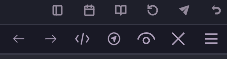
With the back and forward buttons on the page, I hid the two buttons on the far left of the menu bar. The css snippet is in .obsidian/snippets/菜单栏定制.css. 2023-02-27 Update: Obsidian after v1.0 has naturally removed the two back and forward buttons on the left of the menu bar.